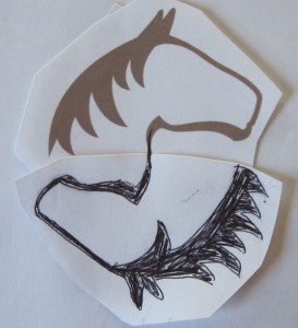
Thanks to the work of two talented women, BestHorsePractices is no longer just domain name that I bought last year.
All my scribbles, scattered files, and multicolored posterboard diagrams have become a real live website.
 I owe a huge public thanks to web designer, Suze Fisher and graphic artist, Jen Cigno. I’ve known them since developing NickerNews years ago when we all lived in Maine.
Four years later, I’m in Iowa and Cigno has moved to Hawaii. Thankfully, distance doesn’t matter in our business.
When developing BHP, I knew how important aesthetics and functionality would be for the new site.
I also knew I’m pretty bad at that stuff.
I offered them a jumping-off point:
- To connect BHP with NickerNews through design.
- Use NickerNews’ two horses heads as a symbol of dialogue.
- We stumbled on the idea of flipping one horse head, to make a yin-yang type design.
Perfect!
Common sense and science will indeed form the yin-yang elements of all BestHorsePractice reviews.
Fisher and Cigno refined the look and altered the font to match the more serious tone of BHP. We selected earthy, close-to-nature colors to reflect the site’s overall message.
It was a thoughtful, fast-moving, fun collaboration.
Thanks, ladies. You’re the best.
