 We’ve been working with the talented T.J. Zark of Hello Zark, a brand and design firm, to develop a great brand for the Best Horse Practices Summit.
Zark, also a talented artist and a gal who grew up on a Nebraska ranch, has developed many award-winning brands and worked for Apple and other entities in Silicon Valley. We’re lucky to have her!
Help us pick the best design for our equine conference. Bear in mind, we have strive to incorporate the ‘thinking outside the box’ element of the Summit and making connections  between practical horsemanship and equine research. We also want to let folks know that this great conference takes place in the beautiful mountains of Colorado.
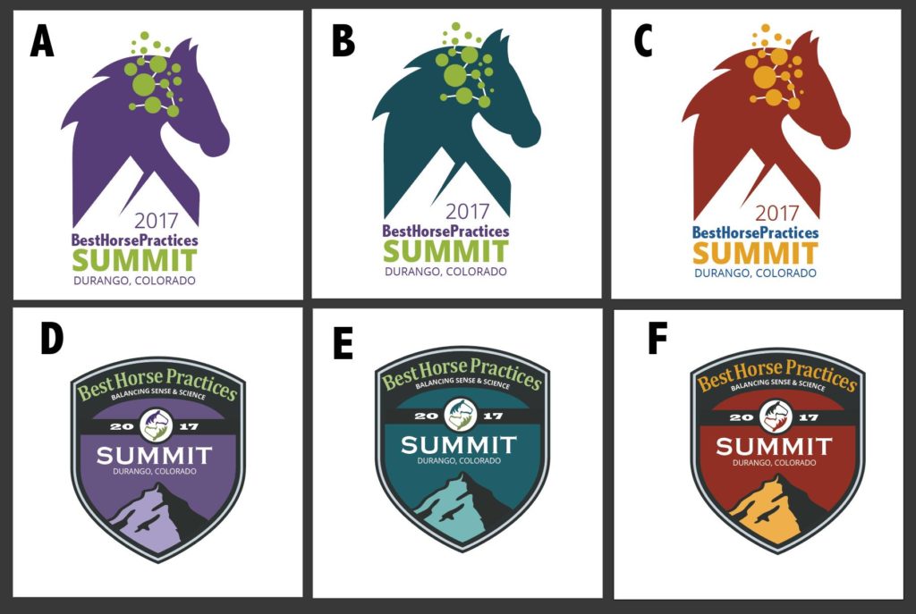
Check out the images below and comment on which one you’d like. Thanks!

B , C gives associations to the Swedish Dalahest image and D E & F looks like a scout group emblem. 🙂
Regards, Geir
I don’t like any of them. They should be a real horse color.
A – Easy to read, excellent color contrast:)
I pick B. The logos in the bottom row seem to feature a mountain peak. From a distance, the horse is hard to see. In the top row, green is the best color. Blue would be better though. There’s research on colors.
A or B-either would look good on T-shirts and posters
D is my choice. It is a powerful color. The badge type is very official look.
I like A and B and I thought I REALLY liked D and E but I think I like them because they remind me of a patch on a brand of clothing I really like so maybe not right for a horse related activity. So, A or B works for me.
“C” is a natural horse color and my choice. I know because it was my horse’s color when I was a teenager.